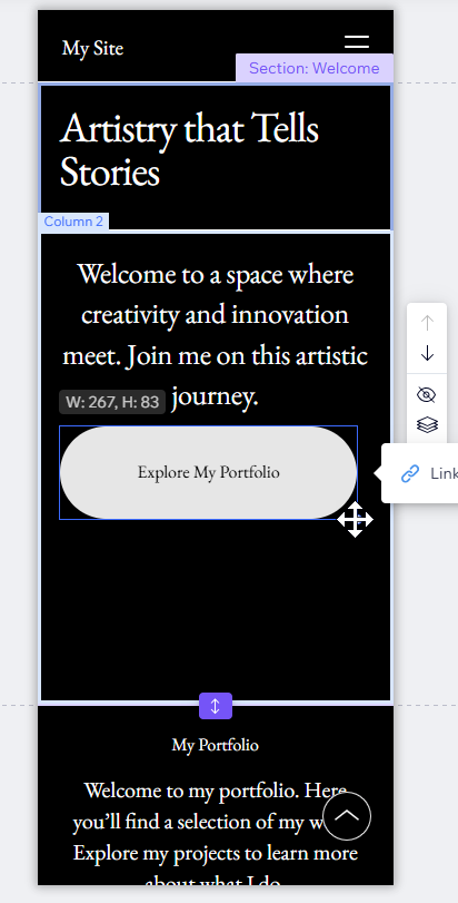
Your text, images and buttons automatically adjust to fit smaller screens. You can also use the Wix mobile editor to adjust how your site appears on mobile devices.
Most layout changes you make in the mobile view won't affect how your site appears on desktop.
How to adjust your mobile site
1
Switch to mobile view
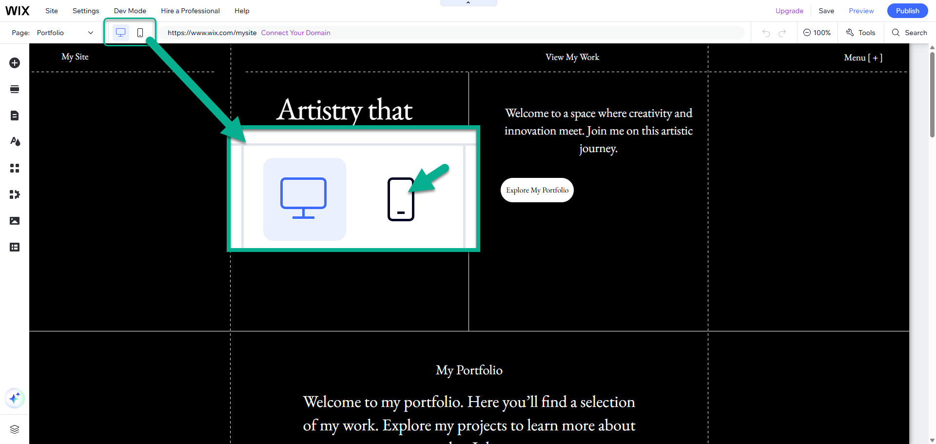
Select the mobile icon at the top of your editor to switch between the desktop and mobile versions of your site.
2
Move or hide items
To move items: Drag and drop them
To adjust the size of an item: Select the item and drag the corner handles
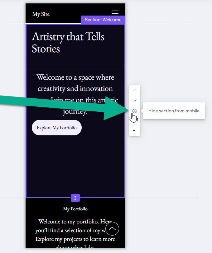
To remove items: Use the ‘Hide’ icon in the mobile toolbar
Note that changing the actual text or deleting an item will affect both mobile and desktop.
3
Check your content
Confirm that your font sizes are easy to read and that the buttons are large enough to select with a thumb.